All copy as provided to the publication.
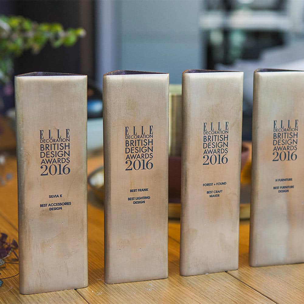
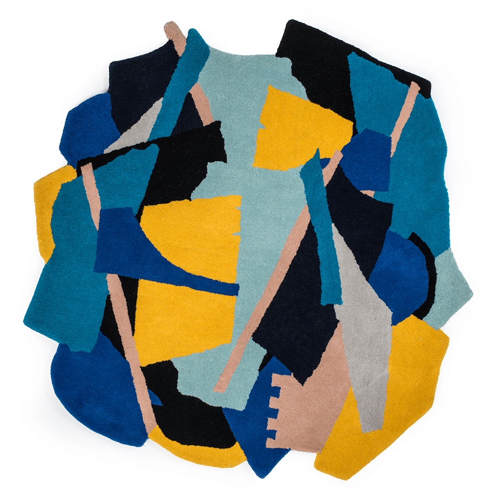
Best British Print and Pattern: Lisa Todd Designs for the Ndebele collection
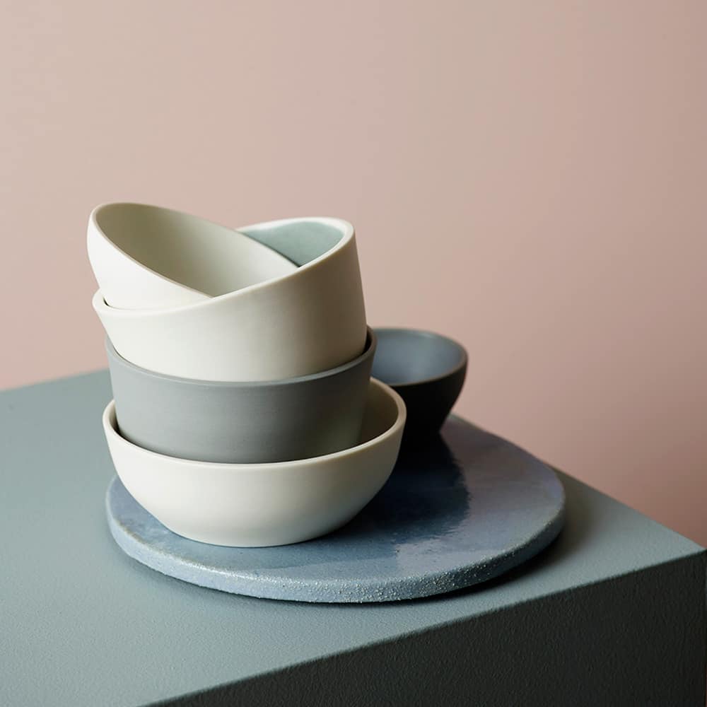
An accident resulting in a debilitating neuromuscular condition proved pivotal in interior designer Lisa Todd’s career: “I had to rethink what I could do and so I started painting,” she says. “I have always been a pattern-maker at heart and fell in love with the versatility and infinite possibilities of surface-pattern design.” Although she describes overcoming the physical limitations of her condition as the hardest part of getting started in her second career, the result of her change in direction is stunning. Informed by a childhood spent in South Africa, her Ndebele collection references the bold colours and patterns typical of the tribe that inspired it. “I have always been inspired by African decorative arts, and traditional skills, in particular those of the Ndebele people,” she says. The collection – a subtle take on the current revival of the 1980s ‘tribal’ trend – is painted by hand in Lisa’s Windsor studio before being printed onto British linens and cottons in England for the cushions and fabrics, and onto organic melamine and birch wood in Sweden for the trays. “Commissioning an African women’s art collective to create a beaded version was a dream come true,” she says. But with the collection already stocked in Liberty of London, and ceramics, rugs, tiles and wall finishes all in the pipeline, it doesn’t sound like this irrepressible designer is stopping at dreams come true.
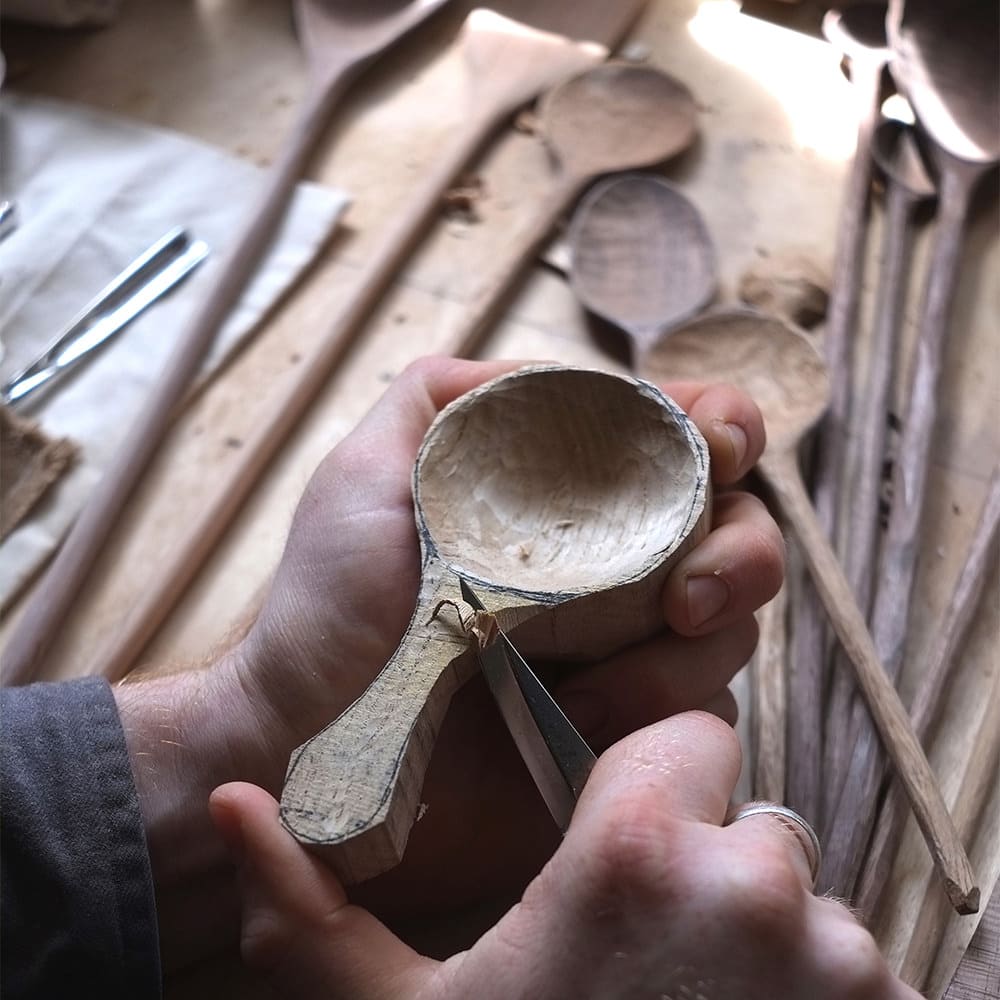
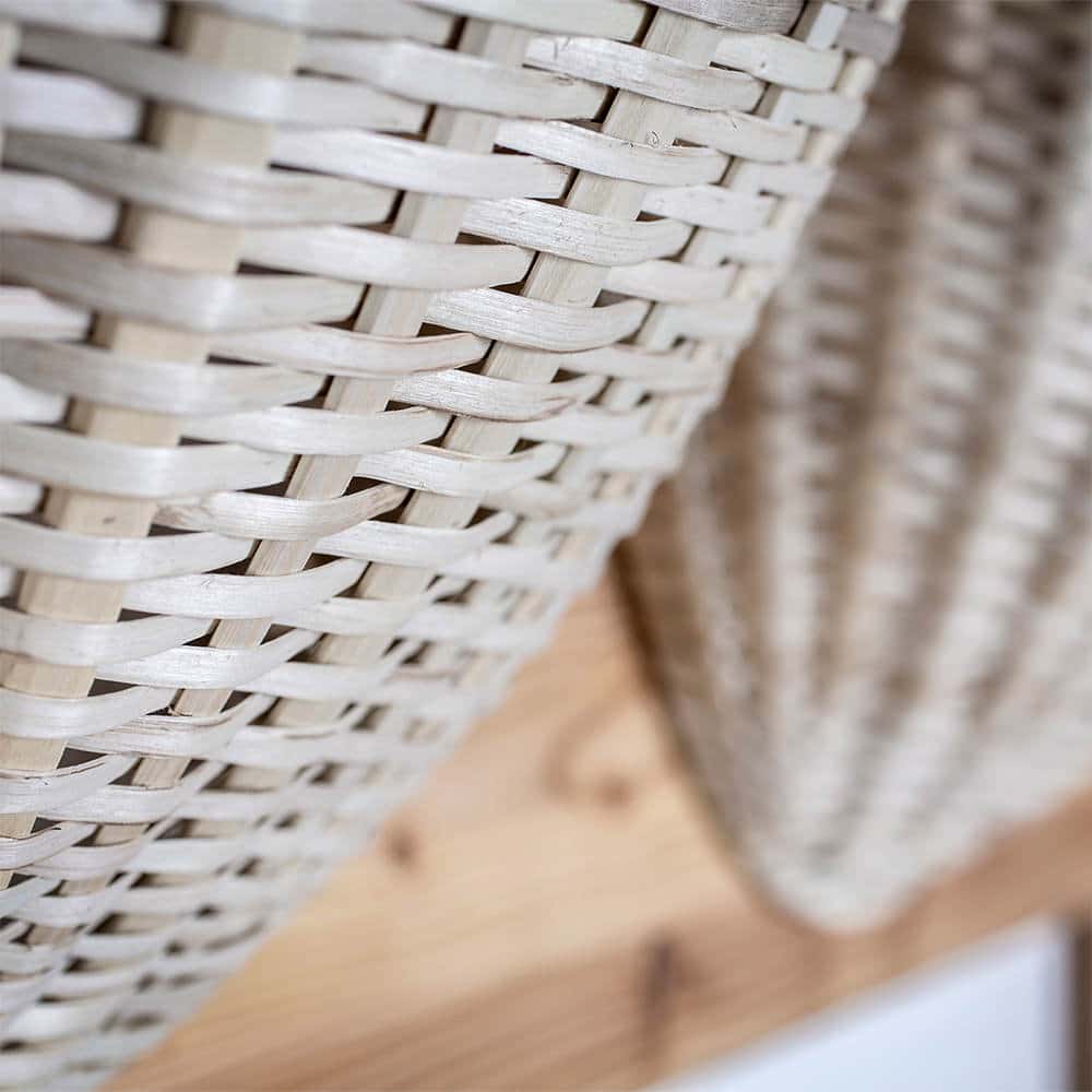
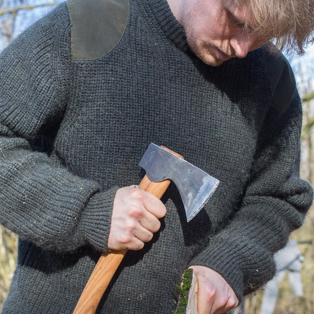
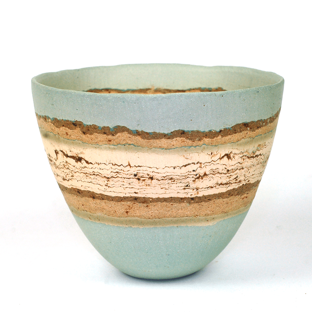
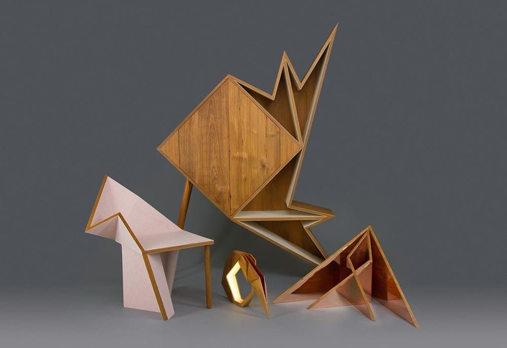
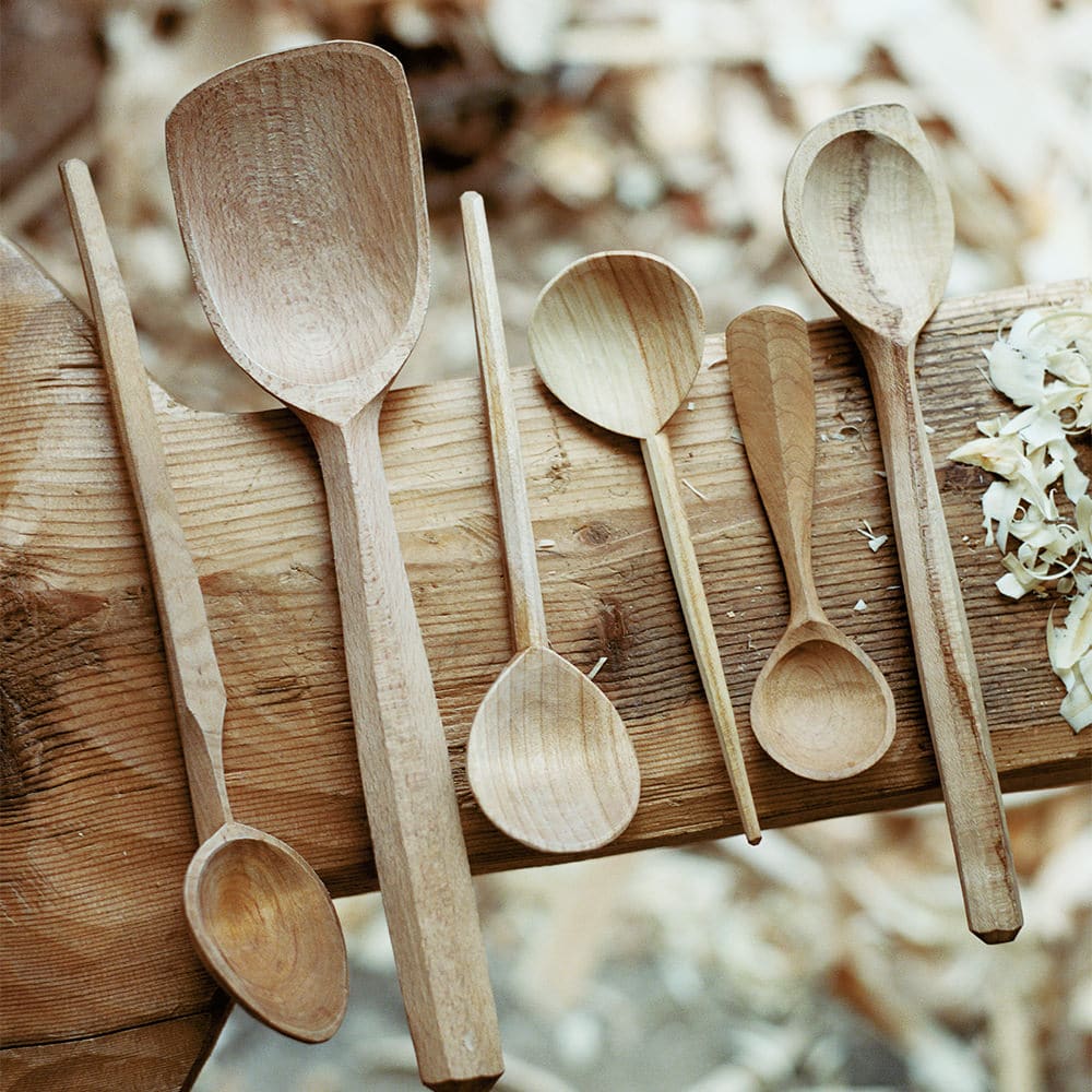
Best British Craft: Forest + Found
East London based Forest + Found is a partnership between Max Bainbridge and Abigail Booth that specialises in hand-carved wooden products and naturally dyed, hand-stitched quilts. “At the heart of everything we do is our relationship with each other and the collaborative nature of our practice,” says Abigail. But it’s their connection to the woodlands where they source their materials and their commitment to traditional making with hand tools that really sets them apart. “There is a inherent beauty and simplicity in natural materials,” says Abigail. “Our dyes come from natural tannins in wood and produce an aged colour palette of soft browns and pale greys that feels muted and yet full of vitality. By hand-stitching into our textiles, every surface is worked and the material takes on a texture that can’t be reproduced on a machine. We want them to feel as if they have already lived for a hundred years.” Their current collection, which includes large wooden vessels, utensils and “quietly emblematic” quilts is inspired by research into making cultures around the world and throughout history. “We are interested in the effects of the passing of time and the rituals that surround the use of objects,” says Abigail. Describing themselves as “completely humbled” by the Elle Decoration British Design Award, the pair have set their sights on a large-scale public art commission next, so it’s unlikely we’ve heard the last from these two contemporary craftspeople.
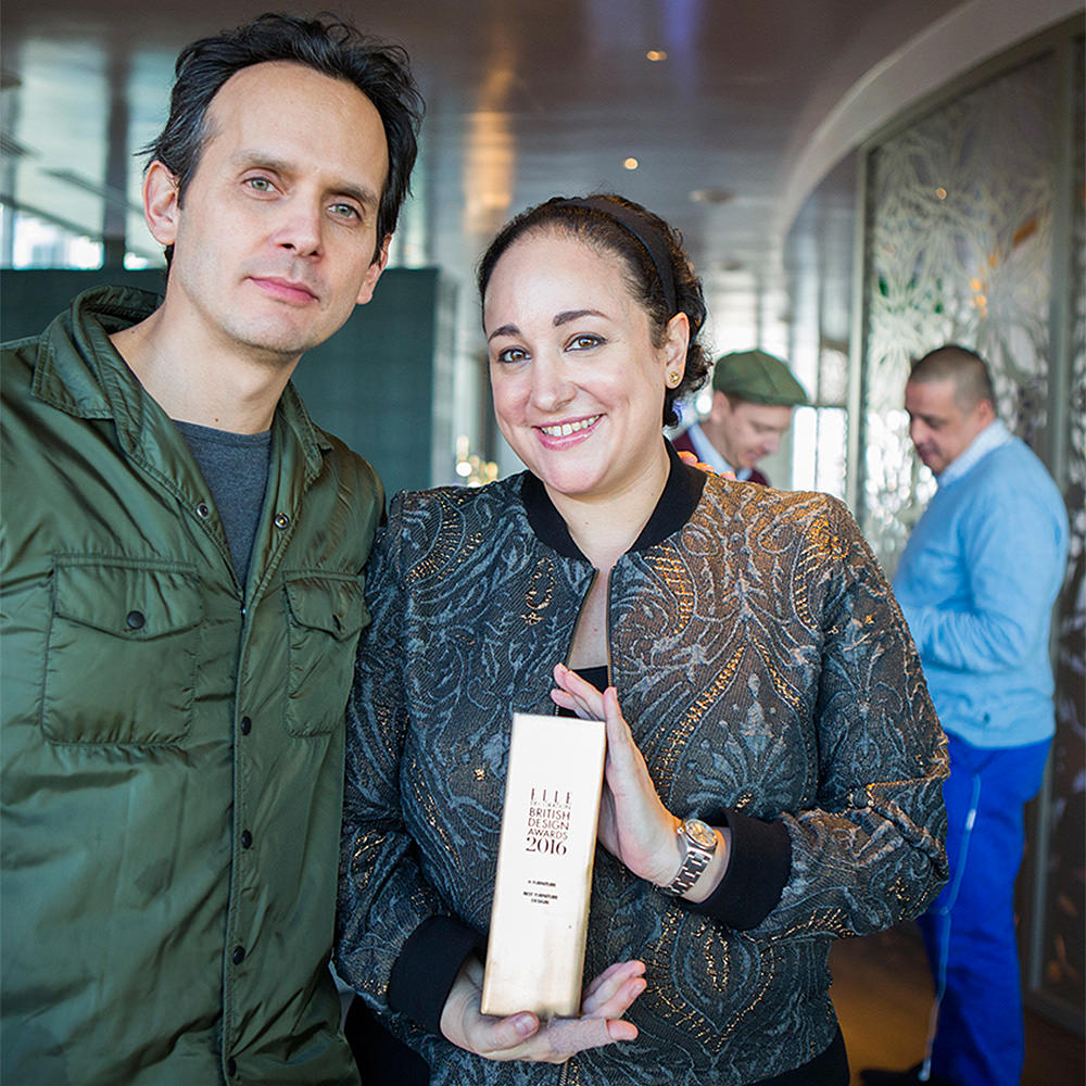
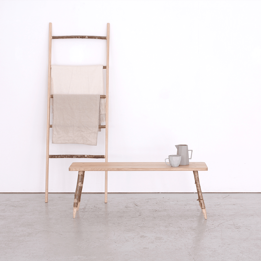
Best British Furniture: H Furniture
Describing itself as “London-based but with a global outlook,” H Furniture was founded by Alejandro Villarreal in 2014 out of a desire to combine craft and industry. “I love furniture because it is a powerful way of communicating your ideas and beliefs at the same time as enhancing people’s lives,” he says. The brand’s recently launched WW chair is a contemporary reinterpretation of the classic Windsor chair in which the typical wooden spindles are replaced with metal rods that connect the backrest to the underside of the seat, making it hardy enough for both commercial and residential use. The Belt hanging rack, by Munich-based Jessica Nebel, is a wooden clothes rail suspended from the wall by two leather straps. “Having worked on a lot of mass-produced items, I was keen to explore natural materials and handcraft,” she says. “The warmth of leather and wood reflects today’s need for authenticity, so my inspiration came from traditional wood and leathercraft mastery.” In response to the British Design Award, Mexican-born Villarreal says, “It came as a beautiful surprise. I really respect the talent that has been acknowledged before and it is reassuring to know that the British community is truly supportive of different approaches to design and creativity.”


 All copy as provided to the publication. Bottom left, near right and far right photographs by